Monday, November 30, 2015

Subjective & Objective

I chose Helvetica Light because it's easy on the eyes, it's thin which goes with the dainty style of the work of designers and illustrators that Paperchase decide to feature. 

I then played with colour. The current colour of the logo is purple. However, there are alterations of the colour of the logo. There is a purple logo, a blue logo and a black and white logo. This is because blue and purple are the brands main colours and black and white logos are for the easily applicable aspect of a logo. It needs to be applicable to many surfaces, products and designs.

_________________________________________________________________________________

Out of Vignelli's six typefaces I chose Helvetica Light . 

The logo design will maintain the original Paperchase colours of purple and blue because they are recognisable and specific to their company. The use of black and white as an alternative colour for the design is effective because it can be applicable to different surfaces and products.  

Thursday, November 26, 2015

OUGD404: Study Task 06 - What is a Book?


What is a book?
1. A written or printed work consisting of pages glued or sewn together along one side and bound in covers.

2.A bound set of blank sheets for writing in.

What does it consist of?
To Kill A Mocking Bird are both fiction books which consist of a story. The Independent Leeds book is a small guide on independent places and things to do in Leeds such as coffee shops.

What are the pages made of?
The ones I have chosen are on a variety of different paper stocks. To Kill A Mocking Bird uses a glossy finish paper for its cover. Nighteen-Eighty Four uses a matte finish paper for its cover and the Independent Leeds - The Little Black Book uses a matte paper as it is a small pocket book. 

How is it bound?
"Bookbinding is the process of physically assembling a book from an ordered stack of paper sheets that are folded together into sections or sometimes left as a stack of individual sheets. The stack is then bound together along one edge by either sewing with thread through the folds or by a layer of flexible adhesive. For protection, the bound stack is either wrapped in a flexible cover or attached to stiff boards."


"It's nice, I like it but it's been done" - don't look for stuff you know that you can make. 

Monday, November 23, 2015

OUGD405: Studio Brief 01 - Study Task 01 - Wayfinding

23/11/15
Leeds Beckett University - The Rose Bowl - Business and Law building 


Library


The Henry Moore Institute research building


Primark


After looking around Leeds for examples of wayfinding. We found that public spaces tend to use a block list of places to give directions and distinguish where you are in that area. For example, Leeds Beckett Rose Bowl highlights the section of their list in grey where you are now and on each different level it would highlight another level. Similar to the Library, it uses a different shade of colour to highlight where you are now. The Henry Moore Institute uses the same method but their list is more illustrative with the use of the stairs in their design. Lists make the places easily legible and it is clear to interpret where you are within the map. 

The Primark one shows where Primark is in Trinity. This map is the most visually pleasing because it includes small illustrations and symbols along with a variety of colours instead of being a block list such as the previous ones have been. 

24/11/15

Leeds Art Gallery 


The signage in this art gallery is very minimalistic. As it was such a big place I wanted to make sure I took a lot of images of the way finding pieces in context to see how scale and composition of the directions was around the gallery. I think that the really basic and simple forms are really effective as methods of way finding because you can glance at them as you pass and know where to go next such as following the arrows as shown above. Whereas if it was text heavy instead of passing by you would have to stop and read it; so if for example the traffic of people within the gallery was busy then no one would need to stop and cause an obstruction to someone else. 

Urban Outfitters


An aspect about this example of way finding is the uniqueness to it. It is the same list style of what purpose each floor in the store had but it is set up in a bespoke way to work with their artwork within the shop. It is easily legible and interesting to look at. The monochromatic colour scheme makes it easy on the eyes and works in theme with their products and stock. 

Tuesday, November 17, 2015

OUGD404: Study Task 05 - How Do You Read? Canons


In a group we tried to list what rules we thought existed within aspects of Graphic Design.


Fionacci & Golden Ratio

The Fibonacci sequence ratio is 8:13 which links to Golden section. This sequence is evident within design and nature. 1.62  forms the basis of paper sizes. Its principles can be used as a means of achieving balanced designs. It is to gain beautiful designed proportions.


Canons
Principles of page layout design used to measure and describe proportions, margins and print area.

Tschichold - Golden Canon

Tschichold - Octavo

Van de Graaf


Wednesday, November 11, 2015

OUGD403: Studio Brief 2 - Typeface Final Design & Evaluation


Final Typeface Design

Type Specimen

Overall, the feedback for my typeface was positive. This proves that it does work for what I intended it to be created for - a display face for high fashion and luxury brands. The only criticisms were that the typeface could be confused with the manifestos whether or not it is the superficial definition or the shallow definition was a comment one person wrote and a few people picked up on the fact that the J could be misconstrued as an I so that would need alternating. There are also issues with the removal of the serifs on S and G which I had overlooked so I need to be more vigilant in my next piece of work for mistakes such as this. I like my final typeface resolution though and found the production of this was much better than the first brief. 


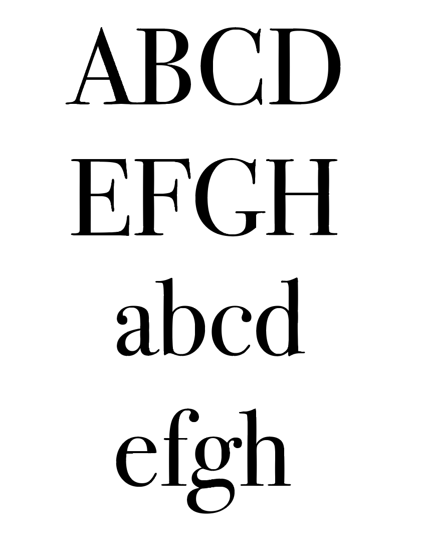
Here I constructed my typeface into the sentence 'The quick brown fox jumped over the lazy dog.' because it uses all the letters in the alphabet. This shows that it works effectively within a sentence and can be legible when the different letterforms are placed together. 

This is my final typeface design. I decided to go with the first manifesto because my crit group unanimously agreed that they had liked the concept and design decisions behind it. I placed the typeface into the sentence “the quick brown fox jumps over the lazy dog” to show that the typeface does work in accordance together within a sentence and is legible and easily read. I think it does demonstrate my design objective of creating a display face which can be applicable to for prestigious brands because Bodoni is originally used for high fashion brands. The simplicity and minimalism would attract companies that are aiming to achieve a more effortless, elegant typeface for their design which I think my shallow typeface achieves. 

I also believe that my specimen shows it can be used as a visually attractive typeface which would be aimed at prestigious brands. The fluidity of the R is why I placed it at a large scale against the background. It shows that the design is flat and would look attractive on multiple surfaces because it is so easily adaptable to different scales. I think the typeface I have created does reflect my manifesto. 


1.What words would you use to describe my typeface?
“Classical - confident and ‘modern’ face.” ,“Modern and fancy” , “Geometric (expection of Q&R)” , “Sharp, sleek” , “fancy, sleek, modern” , “minimal & sheek” , “posh” , “high class, minimalistic, friendly.”

2.Does my typeface work for the audience I’m trying to adapt it to? (Luxury brands)
“Lucy bath company or candles?” , “Yes, very classic, old feel” , “Yes, very luxury could be used on perfume bottles”, “Yes, jewellery brand”, “if you are a high end company, you wouldn’t want to appear as being “shallow” through the use of this typeface.” , “Luxury brands - yes in all areas from signage to print & web - from the heritage you evolved it from.”

3.Does my typeface work as display text? (If not why?)
“Yes” was the answer for all of the people that commented on my typeface.
“Both display & body text will work on them in @classical@ but dependent on weights.”

4.Is the removal of serifs effective to portray a more contemporary typeface?
A majority of people said “yes” and added comments such as: 
“makes it more simple & cleaner”
“on some letter forms but looks out of place on the s compared to the other letters”
“makes more modern although serifs sometimes signify class.”
“yes shows balance / development of old and new”
“serif removal is a really great exercise to ‘contemporise’ a font - it works really well.”

Any other feedback:
“s & g looks like you have forgotten to remove the serifs”
“I like the J maybe change I to an I with serifs”
“curves on the x & z maybe try pointed for consistance”
“works really well as a set - very consistent”
“the style = yes, the concept = i think people would be unsure but very clever.


Tuesday, November 10, 2015

OUGD404: Study Task 04 - How Do You Read? Figure & Ground

Figure & Ground 

The eye differentiates an object from it's surrounding area. Balancing figure and ground can make the perceived image more clear.

The part we pay attention to is the figure which is a positive shape. In a simple composition there may only be one figure and in a complex composition there will be several things to notice. As we look from one to another they each become figure in turn. Recognisable objects (subject matter) are easy to see as figure. Ground is everything that is not figure. An attention shifts from figure to figure the ground also shifts so that an object can go from figure to ground and back.

_____________________________________________________________________________

White Space

White space refers to the canvas and page space left between different elements of your design. you may have also heard it referred to as negative space. White space is seen as a luxury or lifestyle. White space is not always white, any colour can be used as white space as long as it appeals to the same principles as white space.

Active white space - you make a conscious effort to add, it is asymmetrical, more dynamic and active.
Passive white space - this is the white space which is more natural, for example the area between words on a lane or space which surrounds a logo or graphic element.


 GLAMOUR Magazine:


 In advertisements a lot of whitespace is used. It is seen as a luxury. It is effective when the ground of the image is quite plain in advertisements so that it can focus on the product. It is also effective to have the brand name so prominent so that the consumer is aware that it is an advertisement instead of just a photograph.


It is also effective to have a contrast between negative space as exemplified by the image above. The text has a white ground to make the text more prominent and the image has a darker ground around the figure to make the person stand out. This appeals to younger people such as teens and young adults because the image is impactful and the text is easy to read. There is a clean divide between the two so that you can flick through it or read in-depth into it. The text is an example of passive white space.

NEST Magazine:


 There is a lot of white space used for this. This is effective when displaying art work because then it can focus on the actual piece to make it look clean and professional. Again, white space is seen as a luxury so it makes the piece look more prestigious. It is effective and the art work looks really impactful and bold. This is an example of active white space.

Monday, November 9, 2015

OUGD404: Study Task 03 - How do you Read? Grids


For this task we had to place a piece of tracing paper over a newspaper so that we could find the grid that the newspaper uses for each page. I picked up The Independent which when I first started the task I thought had only 6 grids but I found that that did not work for all the pages. To which I then realised it was 12 grids which fit all the pages. Grids are used to keep consistency throughout page layouts and keeps the text and imagery organised.

Thursday, November 5, 2015

OUGD403: Shallow Typeface Two Approaches

Bodoni


My two approaches for the word "Shallow":


modified kerning


A superficial text; meaning a typeface to be used for prestigious brands or luxury places.  Mainly used for brand logos. Uses a sans serif font to follow the design trend of being a flat, easily accessible design for logos which will be readily available and applicable to different surfaces. It will look modernist and contemporary to go along with the concept of being "shallow."
Physically shallow. A sans serif font will make the typeface appear flatter. Thin, light text Which could be used for bodies of text. Elongated letterforms with lower counters on letters such as b to emphasise the shallowness of the typeface. Letters such as a, c, e physically lower to; reinforcing the shallow nature of the typeface. The text also has slightly varied textures to represent the shallowness of nature such as in water and ditches which is why the lines are not completely smooth. When discussed in groups or asking other people what they first thought of when they hear the word shallow a majority of people went to "low water" or "a ditch." This typeface visually represents that rather than the first one which could be used for other purposes. 

Wednesday, November 4, 2015

OUGD404: Study Task 02 - How Do You Read? - Colour Relativity

"There are no ugly colours; there are only ugly colours in combination."

In this task we were told to write down our least favourite colour. I chose the colour orange because it makes me nauseous. It has connotations of sick and the particular shade of orange which is usually used is a muted burnt orange.


I thought that this shade of orange Pantone 717 UP would work in conjunction as an autumnal colour. It has reminded me of pumpkins and autumn leaves so I matched it with a red toned brown shade Pantone 7587. I think they would compliment each other because they are both ugly colours; as the quote would suggest they are "ugly colours in combination." 

Manifesto for Muller-Brockmann's 9 typefaces

In groups, we were each given a typeface out of Mueller-Brockmann's 9 typefaces. Our group was given Caslon and we had to write a manifesto for the font.


Manifestos for the 8 other typefaces:

Garamond

Baskerville

Bodoni

Clarendon

Berthold

Times

Helvetica

Univers