 |
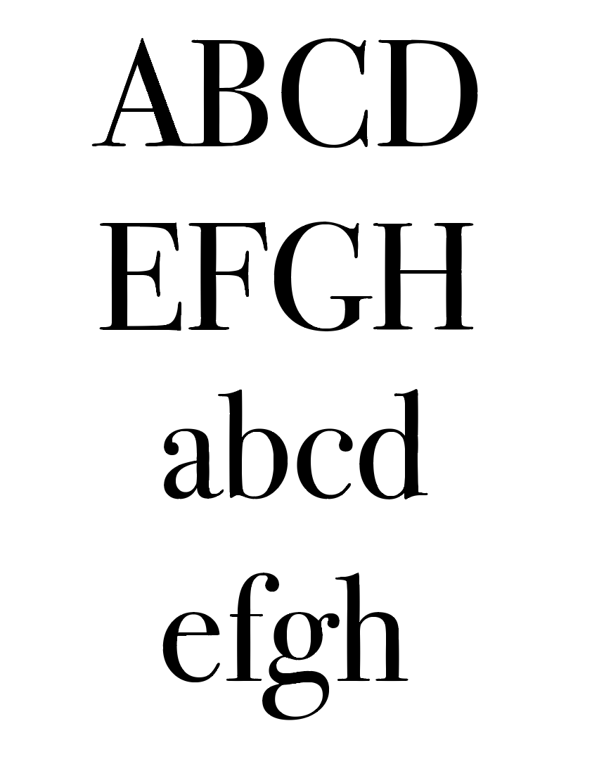
| Bodoni My two approaches for the word "Shallow": |

 |
| modified kerning |
A superficial text; meaning a typeface to be used for prestigious brands or luxury places. Mainly used for brand logos. Uses a sans serif font to follow the design trend of being a flat, easily accessible design for logos which will be readily available and applicable to different surfaces. It will look modernist and contemporary to go along with the concept of being "shallow."

Physically shallow. A sans serif font will make the typeface appear flatter. Thin, light text Which could be used for bodies of text. Elongated letterforms with lower counters on letters such as b to emphasise the shallowness of the typeface. Letters such as a, c, e physically lower to; reinforcing the shallow nature of the typeface. The text also has slightly varied textures to represent the shallowness of nature such as in water and ditches which is why the lines are not completely smooth. When discussed in groups or asking other people what they first thought of when they hear the word shallow a majority of people went to "low water" or "a ditch." This typeface visually represents that rather than the first one which could be used for other purposes.
No comments:
Post a Comment