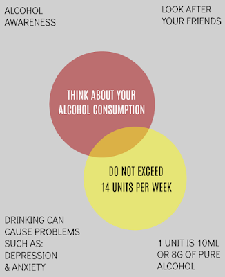
Initial Idea:
Feedback:
- "This looks very formal, not aimed at the right target audience."
-"It doesn't look like a poster. Looks more like a book cover."
-"Not very eye catching."
-"The yellow text on red is good. Reminds me of wine."
"The text at the bottom is too thin."
Development:
The font looks weird being all lowercase.
There isn't really a lot happening to draw your attention to the poster.
It needs more information.
People might not know how much 14 units is.
Still quite plain.
Final poster design:
Feedback:
-"I like the colours."
-"Simple. Gives you everything you need to know."


No comments:
Post a Comment