First Concept: Space
For my space concept. I based this around a method instead of thinking of it first. I knew I wanted to create a universal money to reference the theme of space. This could perhaps be similar to a card in how you can pay online and it transfer over the different currencies. Apart from this would be applicable in shops too. I wanted this to be a screen print so that I could use metallic paints against a dark background. The "money" would have a holographic element which would either be foil or a metallic element to work in accordance with the metallic paint. This would also be the aspect which avoids counterfeit. I'm not sure whether the images should be more illustrative or photographic but I think this concept would appeal to all age ranges and target audiences apart from maybe elderly people because they are more reluctant to give up traditional printed money. However, with new and rapidly growing methods such as Apple Pay and Bitcoin having printed money, physical money is less common.

Second Concept: Constellation
For this concept I wanted to create a glow in the dark screen print. The glow in the dark paint element would be the aspect which avoids counterfeit and the amount of stars or dots on the note depicts how much it is worth. The background would be dark to contrast with the UV aspect and the stars and constellations would be white so that they are still visible during the day.

Third Concept: Illustrative
For this concept I honestly just wanted to draw more. Before coming to uni I spent a lot of my free time doodling and drawing so I gave myself a small task with this one which was to do the illustrations as sketches in 20 minutes as a rough time scale.
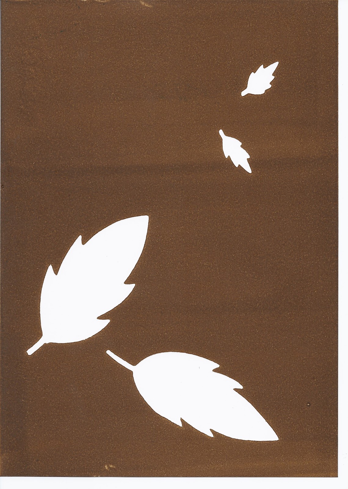
The concept behind this one is to maybe monoprint a background for example the other day I monoprinted leaves because it is generic and could be used as a background for all the notes so that they have some balance between them. Then I would overlay the image on to them but maybe with lino or copper etching as the print technique because I want detailed and accurate drawings. The animals that I put on the notes references the hierarchy of the food chain. The closer to the pinnacle the animal or plant is, the more money it is worth. For example a lion would be £20, the deer would be £10 then the fox would be £5. I added a tree incase I wanted to increase the currency and units and did not want to use insects. I wanted to also use a UV element on this concept to avoid counterfeit. The UV would be contained within the animal so I might draw it's brain using the UV aspect but that may be difficult if I was to do a tree.


Feedback from interim crit:
"The hierarchy concept might be a problem because of people might question whether or not they have as much worth as a tree because of society structure."
However, I don't actually understand this comment because the hierarchy is to show the food chain working in accordance with the price of the money. It was not a comparison with people's worth or societal structure.
"The space concept is stronger than the animal one."
"For the animal one or drawings, screen printing would be a nice method."
"You could put information on one side and the illustration on the other."
"You could put an animal on one side and a hamburger on the other."
I feel like my ideas haven't really progressed since the crit so I'm going to speak to other students one to one and gain more in-depth feedback. I thought that the crit groups were too big. This made the concept of receiving and giving useful feedback difficult because it was hard to hear other people speak. I did find discussion helpful though instead of having to present your work and having people feed back at you.
Feedback from asking people outside the crit:
"More interested in the space concept."
"You can wave your watercolour into that."
"Could be like the northern lights."
"Screen printing might not be your option."
"I think this could look really good."
"I think the animal one could look nice if it's just shapes."
"If it was laid out with the animal shapes and not the head."
"The space one seems like a stronger concept."
"I think they're both strong but it depends how far you can get with both of them."
"Space more to do with the customer than yourself. Someone else would understand it (the space concept) easily than the other one because only you understand it."
"Malika Favre. If you're going to do the animal concept. If you did block colours successfully that would look amazing. It would be easy to distinguish between them like in your purse."

"You could put something cute on it. Like people's favourite animals."
"If it's to do with society then it references the market. Marketing is marketing."
No comments:
Post a Comment