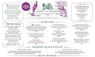
This is the final design for the app. The design uses the fonts PT Sans Caption and Georgia in italic this was the closest I could get to replicating the Bill's typeface's they use on the lunch and dinner menu. As shown below. It needs to be clean and simple. Easy to use and consider anyone that could have difficulties with technology to understand and use. Especially first time customers of Bill's that won't be familiar with the system.
Hidden overall bill function.
The table layout would be set out as each individual person. It would have a list of what the person has ordered and a total at the end. Option to turn on and off the total and individual prices. For example if someone was paying for the group meal or everyone was paying for someone else's birthday meal. That person could "hide" their total so that they don't feel bad for spending a certain amount of money. This would be a tap hidden feature the customer could turn on and off so that they can check without the other person having to see if they don't want to.
On the left side there is a bill overview so you can see the bill as a list
and the other side has support for if you need help or there are any issues with the bill.
This page comes up if you need support.
If you press "request help" these options come up to select. You can choose to request a member of staff to come over to the table such as a waiter or waitress. Optionally you can request to speak to a manager but only if there are major issues. You can contemplate an issue with the bill. Which means the member of staff comes over and presses that button which will take them to this page:
Originally, the design was going to scan in a card similar to self check out but if it is on an app it's easier and more efficient to place in a pass code to authorise access.
Once the access has been authorised this page will be shown to the member of staff and they can select an issue.
Refund item(s)
There would be two options for the staff to refund item, if it needs to be specific items the first window shows the overall bill.
The second window shows the table layout so you could refund an entire persons meal.
Finalised app design:
This page would revert it back to the original pages.


No comments:
Post a Comment