1. Brief:
The brief was to find a company we thought needed rebranding and to design a logo for it using only type.
Company I decided to rebrand: Paperchase
Why: My rationale for rebranding paper chase was to make it reflect the unique selection of quirky in house designers they feature within their company.
Original Logo:
My Logo:
2. Research:
Some of the people's work they feature:
Paperchase is proud of the ideal they use inhouse designers
 |
| Happy Jackson |
 |
| Gemma Correll |
 |
| Sophie Corrigan |
Competitors:
I found competitors for Paperchase were stationary shops that also sell miscellaneous objects. They all feature red so I think it's good Paperchase deviates from this trend.
3. Ideas
Final 5 Variations of Logos:
Hand rendered type
Daniel
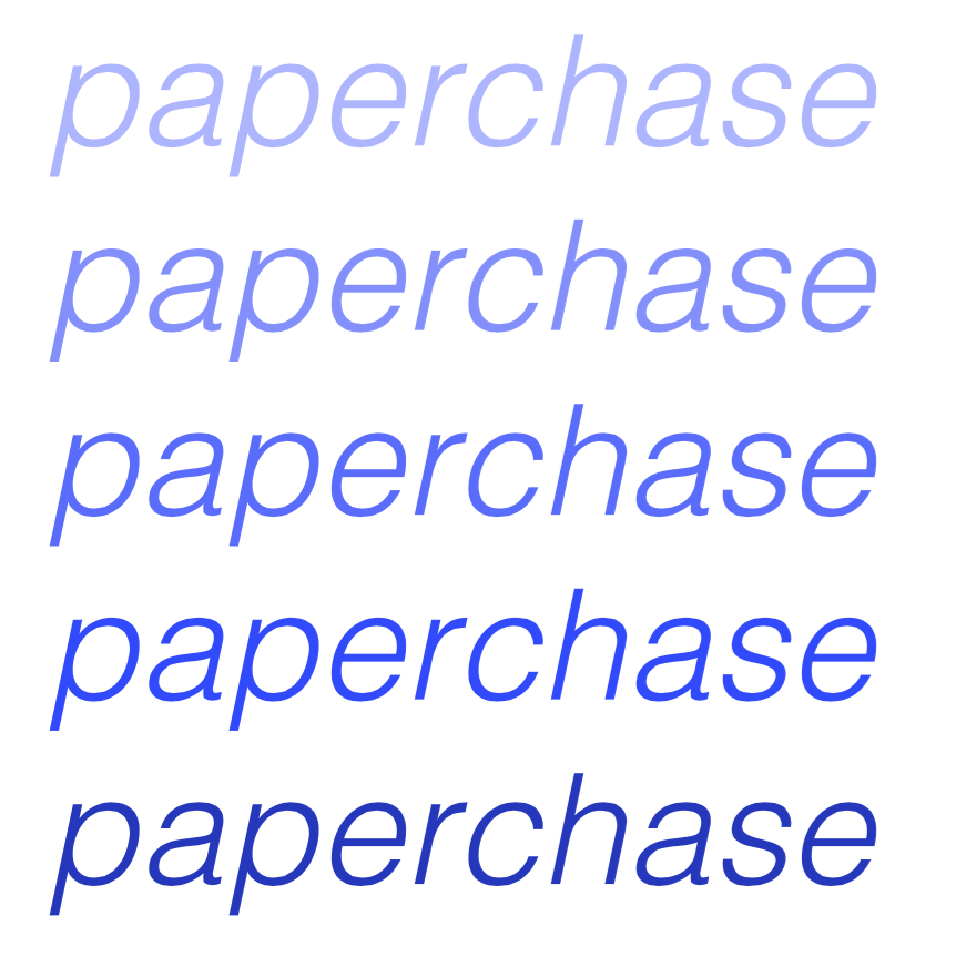
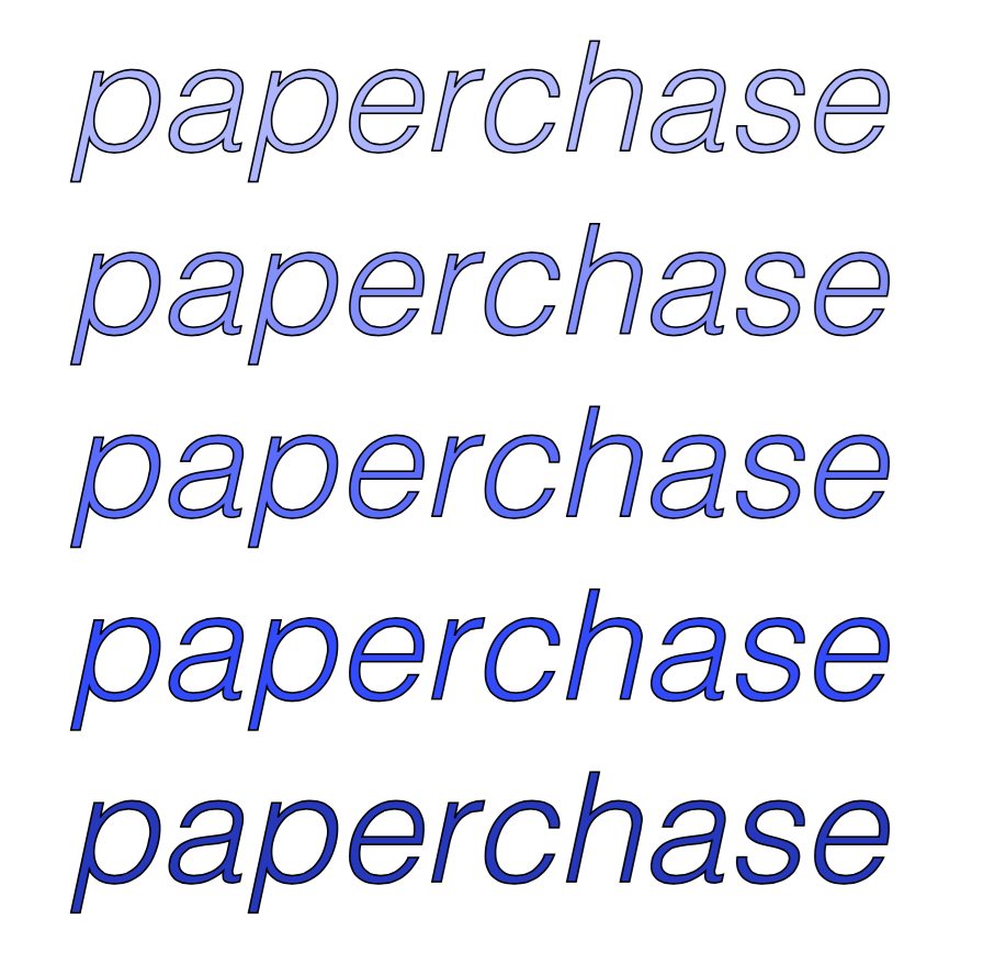
Helvetica Light
Helvetica Light in Italics
Chasing Embers
4. Feedback
Summative feedback session:
Questions & Feedback
1. Does my rebrand reflect the target audience of teenagers/young adults, if so why?
"Colours appeal to the target audience."
"Yes - fun interactive font that represents the company."
"The type is hand rendered which automatically makes the brand fresh and vibrant which would appeal to younger adults & teens."
"Yes, the hand rendered type is bespoke and the texture inside it appeals to target audience."
"Yes, very feminine but not child-like / too immature."
2. Do you think the colour of this logo would appeal to both genders?
"No, I feel it's very much on the female side."
"Can't decide if it is a gender neutral colour, as a female it is appealing to me."
"I feel purple still may be too feminine and blue/orange may suit better."
"Yes because I like it and the girl sat next to me likes it. Plus the colour scheme is strong."
"Yes, because it is a bluet-purple, although I don't know if the font would appeal to boys."
3. Would this colour work on a backlit sign light?
"I would have tried a range of colours."
"I think that the colour needs to be stronger or on a light grey background to make it stand out."
"Colour would work on a bat lit design - may get lost on labels, receipts etc?"
"Due to it being a lighter colour I think it would work."
"It works with a white background so I would suggest making colour a little bit darker."
"Because there are patches of white, the sign might not work as well as a solid colour, but I like the watercolour effect."
4. Does my logo reflect a quirky and unique company which uses in-house designers and illustrators?
"I think the logo is too similar to the current logo."
"Represents the type of company & what they sell, this is shown through the texture & creative free flowing font that is used."
"I think the logo has character and appeal - especially with the textures and would represent the brand clearly."
"Yes because the texture in the letters is 'arty' and soft. I like it a lot."
"I think the fact it is handwritten represents this."
Other feedback:
"Colour could perhaps be changed from original?"
"Font looks 'hand-crafted' which really suits the company - good colour choice, natural, fits with many of their other colour schemes."
Response to feedback:
I wanted to try a range of similar shades to the original Paperchase logo because that is what makes it unique to that brand. I think that blue's and purples are a gender neutral colour meaning the current colours appeal to both sexes. I do agree with the final statement to some degree, they are quite similar.
5. Final