

In a previous development post I had shown examples of sketches for potential rebranding of Paperchase. I chose hand written type because Paperchase's current logo is a hand written logo. I then chose 5 finalised sketches to digitally edit.


This is my favourite of the five because it is simple and smooth. The letters flow seamlessly together which I think gives Paperchase a very sleek aesthetic. However, I wanted to experiment more with pre-made fonts to make the company appear more corporate. I want to make it more stylised and contemporary. I feel like maybe this one looks too simplistic and handwritten. Here are a few handwritten styled fonts I experimented with:

None of these looked like the aesthetic I wanted to use to represent Paperchase. I then attempted a trendy, minimalist rebranding for Paperchase. I chose helvetica because with slight kerning and editing of the font, a new, fresh design can be created which will be personal to the company. It is also one of the six types in Vignelli Canon.


I chose Helvetica Light because it's easy on the eyes, it's thin which goes with the dainty style of the work of designers and illustrators that Paperchase decide to feature.
I then played with colour. The current colour of the logo is purple. However, there are alterations of the colour of the logo. There is a purple logo, a blue logo and a black and white logo. This is because blue and purple are the brands main colours and black and white logos are for the easily applicable aspect of a logo. It needs to be applicable to many surfaces, products and designs.

Here are a variety of blue and purple shades I think could work with the brand because the colours and light giving it a fresher look than a dark colour. I particularly like the second and forth one down because they are quite muted purple and blue colours. I want to keep a vibrant colour for the logo because it would be easily recognisable and distinguishable to Paperchase. For example if you were walking down hughstreet and you could see it in your peripheral vision and know that that colour was to represent Paperchase. Whereas if their main logo was black and white it may be confused with other brands. However, I think that the logo will have a black and white version to show that it will work on other surfaces.


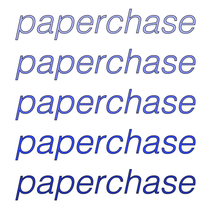
I then played with more shades of blues and purples then added a thin outline to see if it would make the text more prominent as it would be used for a logo and I think that the outline darkened the colour and makes it appear more sleek. However with a plain black and white logo I don't think it works as well as demonstrated by this example:

I want to keep it a light pastel colour so that the rebrand is fresh and fun.

I then decided to play with the kerning slightly.
After having a short discussion with some of my classmates we decided that the image of Paperchase is quite fun and quirky it is aimed at teens and young adults so the logo needs to reflect that. Instead of continuing with trying to make the brand look more corporate and sleek. I decided to sketch out some more fonts of what I thought the logo should look like. I still liked the idea of a handwritten font:


These are the four fonts I decided to choose because they have a more quirky aesthetic to them. Whereas I think my hand rendered logos look too simplistic. Hand lettering is something I want to practise more.

Autumn Chant
I like this font because it looks like scripture. However, it is difficult to read and would could illegible at a smaller scale. The lettering capacity takes up too much space on a page. I had to make the font size smaller just to fit it within the space given. It's far to spread out.

September Mornings
This font is too simplistic. It doesn't make the word Paperchase stand out or give it's own identity. It's very narrow and close together. The font is also tiny.

Dk petite four
I feel like this is too sketchy looking. It reminds me of bubble writing as a child and although the font is fun and quirky looking, it becomes almost illegible when made smaller.

Chasing Embers
This is my favourite of the four because it perfectly embodies a handwritten font which keeps a bespoke style which would give Paperchase it's own identity. I think the font works well inconjuction with the colours too. With the kerning on the bottom I think that the font becomes more legible and could be applied on a larger and smaller scale to surfaces. I like the ones with the modified kerning because it gives the word more movement and fluidity making the logo more unique to the brand.
Final Outcome:
This is the final outcome I chose to use because this is what I think would work best with the company Paperchase. It keeps the hand rendered element but it is a pre-made font from dafont. I chose this pale blue colour because although Paperchase's stock is predominantly aimed at females, males can purchase things from there too. This shade makes it more gender neutral. I think the colours and the style of the font work well with what Paperchase embodies as they use in house designers. Paperchase feautres people like Gemma Correll and Sophie Corrigan. I can imagine their illustrative cards with this featured on the back.


No comments:
Post a Comment