Friday, April 29, 2016

OUGD406: End of Module Evaluation

Within this module I enjoyed the Secret 7 Brief and Studio Brief 04 the most. It was interesting learning about what the guidelines and rules were for a live brief and being set one from outside the our current academic study. I really enjoy music and album art so it was fun to try and creative a piece where we had to really look into the song and sounds and find a depth and meaning to create an exhibition piece. I also really enjoyed studio brief 04 because it reminded me of PPP which has been my favourite module so far. I felt like we were given a lot of creative freedom and independence especially considering we had to write our own brief. However, it also showed me how difficult it was to actually set a brief. The guidelines needed to be vague enough so I could explore a variety of ideas around the same topic but also clear enough so that I had a structure to follow such as documenting things on my blog and creating design boards. 

I really didn't like the money brief as much as thought I would. I feel like this is because I didn't like my concept or design. The printing process is also very frustrating when it goes wrong but it's something I would like to improve on and constantly try to include in my work because I enjoy using analogue methods to work. I feel like there was a lot of creative freedom for this brief (studio brief 02) too but it wasn't something I was personally interesting in designing. 

Before studio brief 03 I was dreading working in a group. I'm quite a quiet and outspoken person. It's difficult for me to get my point across with work because I put myself and my work down. The group I was given was actually really good though. They were all nice and we all equally contributed to the discussions and within a group chat. We were consistent in meeting our small deadlines. But I do still think that it is easier to work with people that you actually speak to and hope one day we can pick our groups because I never show my friends my work so it's not like we know how each other works anyway. Plus it's easier to tell your friends you don't like something and what to improve on than it is to a stranger. 

Overall, this module has been one of the best out of all of the modules but also having all four briefs alongside our other modules such as design principles and cop was difficult. I think what also made it harder was that we had only a few days between submissions whereas other courses had weeks. But I did enjoy the briefs within this more than others in Studio Practice. 

Wednesday, April 27, 2016

OUGD406: Studio Brief 04 - Reflective Practice - Speaking From Experience - Final Resoultion


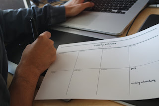
The design resolution is going to be a downloadable pdf file. This is to be more environmentally friendly. The user could fill it in on their computer and only print out what they would need. For example: you could print one out at the beginning of the week each week instead of having a stack of sheets. This way it is not compulsory to use one every single week. You could just have one sheet for if you're particularly busy one week. I also preferred the printable style opposed to a desk pad because I personally stick a lot of things on my wall so I have them up and at eye level so I can visually see them. Whereas desk pads are quite thick and bulky. This makes the design cost effective and cheap to produce. It means it can be distributed to everyone without being expensive. It can be printed on standard photocopy paper that is cheap because you essentially just write all over to do lists and cross or tick tasks anyway.  

The physical print out:


My working environment:


A male working environment:


A female working environment:


Rationale:

At the beginning of the year I was really organised and on top of university work. When more brief's started coming along and the course became more intensive it got more difficult to keep on top of everything and spend equal time on everything. I found it really helpful to have things planned for the weekend or as a nice thing to do. It motivated me to meet shorter deadlines that I had made otherwise I wouldn't get to do the nice thing. I adapted this mantra into a weekly planner so that a student could organise their entire week and see they need to have done day by day. As it is a printable pdf file it is cost efficient and you only need to print out what you need so it doesn't waste time or space. An entire pad or month could look very daunting but I felt like realistically it's not time effective to do a day to day planner. At least this way you could sit down sunday night and plan your week and add to it as you go along instead of having to set a new one every morning which may waste time in very busy periods. I wanted to keep it very simple and adapt a hand rendered style which is something that reflects the design style I want to concentrate more into my work. 

Evaluation:

Big up my flatmates Steven and Kim for filling these out for me and organising their weeks. :)
 I wanted to demonstrate visually the piece in a working environment and show that it could work and appeal to both genders. I personally don't feel it looks out of place or too feminine because of such a simple design. 

The grid makes it organised and clear at a distance. This is probably my favourite thing I have designed since being on the course and it was nice to look into other peoples creative spaces. It is an easy and efficient way to organise your time for academic or personal things. It's something that could be used throughout the summer and looks nice.  

The final design uses 12 pt font size for the week days and "organising my life" text because 10-12pt is the optimal pt for print. It is also the default for digital word processes. It's small enough not to fill up too much space which had been a problem within the feedback but it is prominent enough.  There is sufficient spacing and the sheet focuses on utilising the space to write rather than the actual design. It is more of a practical piece to use. 

I really enjoy writing to do lists and planning out my week so this is something I will definitely be using. Although I manage my time quite well with small tasks, larger overall tasks and preparation for final pieces I am not good with so hopefully having a day by day planner will help me for second year and future tasks. This would be a useful substitute for my to do lists.  Instead of just knowing I have to get it done, I will have a weekly plan for doing things. 

Final feedback:

"Simple layout. Big enough for me to write all the things I needed to do for the day. Not overly complicated. It helped me become organised and a better person."

"I think the weekly planner is really nicely done, it's spacious enough to fit a lot in, and it doesn't what you need it to do! I love things like this so I'd definitely use it again! I thought after I should have scanned it in and printed more before writing on it haha. I really love it 10/10 would use again."


Tuesday, April 26, 2016

OUGD406: Studio Brief 04 - Reflective Practice - Speaking From Experience - Finalised Design Ideas

After looking at the feedback for my initial design ideas I chose these three pieces to taken on and develop to my concept. As the different opinions varied quite a lot.

"Too much space is taken up by the design (title), utilise space for writing."

"More space for days of the week, less space for goals and "exciting adventures" - gives people more room to plan and add things during the week."

"Are they necessary? Perhaps add them as a part of the week table?"

The final design:


I feel like this utilises the space within the page more.  I converted it back to black and white so that it would be cheaper to mass produce and distribute. This would also be printed on quite thin stock something that is cheap again to produce because each pad would have multiple sheets or at least enough for the academic year. It's also sleeker looking. Someone suggested to add imagery but I feel like that could be too steered towards a specific gender whereas this is more neutral. 
I feel like having overall goals is very important because then there is extra room to add things that are of higher importance. It's also nice to see visually what you are doing day to day so you can look forward to things. This is how I force myself to do work when I am feeling unmotivated. I plan something exciting so that I have to do it before I can do my fun thing. This is something that I would genuinely use because at the moment I just write large lists. 

OUGD406: Studio Brief 03 - Investing In Art - Finalised Group Project Work and Evaluation

Everyone's individual contributions and work:

Mine:


Connor:


Alice:


Alejandro:


Connor:


Katie:


Group Contract:
Throughout we hard organised short deadlines and small group contracts similar to this:


This ensured we all did the work and had jobs. They were all agreed with in group meetings and we constantly helped each other if help was required. 


Concept:

Our concept was to focus primarily on the typeface. We chose sevastapol interface.
We adapted this typeface into a style that works in accordance with what we were trying to achieve through the exhibition design. This typeface links because it is geometric and futuristic. This reflects the construction of the building. It's visually interesting and dynamic. We decided to chose a stock market approach to the exhibition which resulted in the name change "Investing in Art."


Considerations:

Location: Bank House

Exhibitors: LCA Students Level 4 and 5
Social media, links, hashtags etc: InvestingInArt, LCAExhibition.  

Contact Details: For the group we contacted each other through Facebook. Contact details for the exhibition would be a Facebook page and on the twitter page.

Signage, way-marking: We have chosen to keep quite a minimalist modernist theme and approach to our design so that it does not distract from the actual exhibition art work. This keeps a consistency and makes it simple to navigate throughout the building. 
Opening night Invites: The concept considering giving away a press pack to design studios. This is what I decided to design and create. Example mock up of what would be given:


It would read: 
"Dear [Insert Design Studio,]
We at LCA would like to invite you to the Investing in Art exhibition. This will be held at Bank House, Leeds and take place through May. It is a unique and innovating exhibition of Level 4 and 5 work on the concept of traditionally printed money and the future of the bank note. Hope to see you there!"

The pack will include UV hand written message on the back to give a more personal aspect to such a geometric and digital design. It will give an aesthetic contrast and make it an interactive invitation instead of giving the feel of junk mail. We want the people invited to feel the time and effort that has gone into the exhibition work. This is because all of the work is traditionally printed which would also contrast with the design of the exhibition.

Self Evaluation:

I think that I contributed a fair amount of work towards the group task. I enjoyed creating a press pack for the exhibition. I think it links in with the exhibition design and keeps a consistency. I feel like I could have contributed more to the group in some group discussions I felt slightly like I wasn't saying enough but it is difficult when there are so many ideas and things to discuss back and forth. 

Peer Evaluation:

Overall our group worked well together. Everyone did equal amounts of work but I feel like Nicky and Alice did contribute the most in the group. Everyone helped give concepts and ideas initially and we were consistent in making weekly contracts for the project which ensured we were all on top of the tasks. This also made sure that the group project did not get lost within all the other pieces of work and made sure we all knew what we had to do.