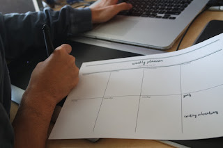
The design resolution is going to be a downloadable pdf file. This is to be more environmentally friendly. The user could fill it in on their computer and only print out what they would need. For example: you could print one out at the beginning of the week each week instead of having a stack of sheets. This way it is not compulsory to use one every single week. You could just have one sheet for if you're particularly busy one week. I also preferred the printable style opposed to a desk pad because I personally stick a lot of things on my wall so I have them up and at eye level so I can visually see them. Whereas desk pads are quite thick and bulky. This makes the design cost effective and cheap to produce. It means it can be distributed to everyone without being expensive. It can be printed on standard photocopy paper that is cheap because you essentially just write all over to do lists and cross or tick tasks anyway.
The physical print out:
My working environment:
A male working environment:
A female working environment:
Rationale:
At the beginning of the year I was really organised and on top of university work. When more brief's started coming along and the course became more intensive it got more difficult to keep on top of everything and spend equal time on everything. I found it really helpful to have things planned for the weekend or as a nice thing to do. It motivated me to meet shorter deadlines that I had made otherwise I wouldn't get to do the nice thing. I adapted this mantra into a weekly planner so that a student could organise their entire week and see they need to have done day by day. As it is a printable pdf file it is cost efficient and you only need to print out what you need so it doesn't waste time or space. An entire pad or month could look very daunting but I felt like realistically it's not time effective to do a day to day planner. At least this way you could sit down sunday night and plan your week and add to it as you go along instead of having to set a new one every morning which may waste time in very busy periods. I wanted to keep it very simple and adapt a hand rendered style which is something that reflects the design style I want to concentrate more into my work.
Evaluation:
Big up my flatmates Steven and Kim for filling these out for me and organising their weeks. :)
I wanted to demonstrate visually the piece in a working environment and show that it could work and appeal to both genders. I personally don't feel it looks out of place or too feminine because of such a simple design.
The grid makes it organised and clear at a distance. This is probably my favourite thing I have designed since being on the course and it was nice to look into other peoples creative spaces. It is an easy and efficient way to organise your time for academic or personal things. It's something that could be used throughout the summer and looks nice.
The final design uses 12 pt font size for the week days and "organising my life" text because 10-12pt is the optimal pt for print. It is also the default for digital word processes. It's small enough not to fill up too much space which had been a problem within the feedback but it is prominent enough. There is sufficient spacing and the sheet focuses on utilising the space to write rather than the actual design. It is more of a practical piece to use.
I really enjoy writing to do lists and planning out my week so this is something I will definitely be using. Although I manage my time quite well with small tasks, larger overall tasks and preparation for final pieces I am not good with so hopefully having a day by day planner will help me for second year and future tasks. This would be a useful substitute for my to do lists. Instead of just knowing I have to get it done, I will have a weekly plan for doing things.
Final feedback:
"Simple layout. Big enough for me to write all the things I needed to do for the day. Not overly complicated. It helped me become organised and a better person."
"I think the weekly planner is really nicely done, it's spacious enough to fit a lot in, and it doesn't what you need it to do! I love things like this so I'd definitely use it again! I thought after I should have scanned it in and printed more before writing on it haha. I really love it 10/10 would use again."


No comments:
Post a Comment