Research into psychedelic patterns.
Psychedelic means relating to or denoting drugs (especially LSD) that produce hallucinations and apparent expansion of consciousness.
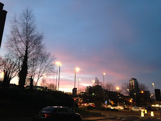
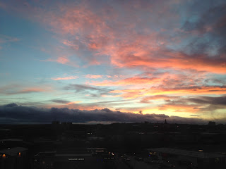
The distorted colours reminded me of sunsets. I feel like making a vibrant, kaleidoscope would look too obvious and resemble hippies which is the aesthetic Tame Impala have but I wanted it to be more a less obvious design. For imagery it would be hard to take photos of this type of effect so I thought the hues in sunsets give a similar effect and it's natural.
"Blue light is scattered in all directions by the tiny molecules of air in Earth's atmosphere. Blue is scattered more than other colors because it travels as shorter, smaller waves. This is why we see a blue sky most of the time."
These two images were taken in the morning as the sun was rising.
This was taken in the evening when the sun was setting.
I reflected on the paper cutting and decided to make the text white so that it stood out amongst the image then centralised it because it is the focal point of the record sleeve. I want the phrase to be the hierarchy of the sleeve then the sunset to be the background even though it fills the entire square. The phrase is what is prominent against it. I then used Helvetica Neue instead of a monotype typeface simply because I couldn't find it online unless I bought it. Helvetica is an easy to read sans serif font I thought worked well with this concept. The letters fit nicely and is thick enough to stand out against the background image. I added the square to give it an extra dimension and to condensed the text into a frame so that it wasn't loose.
I wanted to experiment with all the images and spacing between the letters. I also couldn't decide between the two phrases as ignorance is bliss is a synonym for the less I know the better but it doesn't look as clear as together / to get her. It might be too obvious it is for that song. The way the type is set also put me off because it looks too long and was difficult to place into the frame.
kerning is no
Feedback on the album cover ideas:
Three people voted on using this image.
This kerning and type setting for the type.
"I like that the sunrise is more subtle and it includes the city."
"The words being justified looks horrible. There's too much space in-between them. That (the last one) looks better than that (the justified one)."
"Simplicity is key."
"It's good that it's really minimal."
_____________________________________________________________________________
I kind of feel like this is too obvious and doesn't look like an exhibition piece and it could be an actual cover for a record sleeve but I like the concept and aesthetic of this.


No comments:
Post a Comment